Evernote
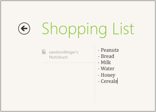
Evernote looks nothing like the desktop "Windows 7" app, but rather a built-from-scratch and completely redesigned tile. It works as expected: You create notes, you read notes, you sync notes.
What I don't get, however, is that Evernote doesn't offer a Preview tab that shows notes, but rather just small icons. I'd bet that this gets corrected soon.
Video app
A built-in app, but impressive nonetheless: Microsofts "Video" app ties in with the Zune video store. The marketplace offers several hundred movie downloads and rentals it's no iTunes yet, but the prices can't be beat. Several very recent movies go for 280 to 420 Microsoft points (oh yeah, did I mention you need to pay with Microsoft points? Yuck!) both in HD and SD. Only a handful of older movies ("Forrest Gump," for example) are priced higher than that.
The app itself is beautifully designed. Simple and elegant. Click on a movie poster and you can easily buy or rent a movie.
Cook Book
Amateur chefs, here's one for you: The Cook Book app sports more than 200,000 recipes from the Big Oven service. You can select from a variety recipes and get detailed lists of ingredients, instructions and user reviews.
Kayak
Here's another service that greatly benefits from being an app, instead of a (mostly) ad-cluttered website with information overflow. The Kayak app is simple and does what it's there to do: Find the best hotels. You'll get reviews, directions (using Bing Maps, what else) and photos for most hotels in the world.
Vimeo
What? No YouTube? Not a problem: Vimeo offers mostly higher-quality videos and is not nearly as littered with stupid clips. The vimeo app is probably one of the most beautiful apps out there and sports a very -- dare I repeat it -- "fast and fluid" experience. And yeah, it's really fast and fluid.
Dictionary
Use the Dictionary.com app for pretty much anything you'd use a dictionary for except maybe an impromptu booster seat or DIY flower press.
WordPress
Popular blogging platform WordPress has a nice little app on the Windows Store. It displays all blogs very elegantly, and allows you to browse for topics and share links, pictures and quotes from any app. Say, for example, you've created a neat little image using Ashampoo ImageFX (No. 8). Just bring up the Charms menu and select Share, WordPress. That'll copy the picture to WordPress and onto your blog. This concept works with many apps on the store.
Ashampoo ImageFX
This one's more playful than useful. ImageFX lets you apply tons of cute effects and filters on your images both local and on SkyDrive. You can share it with any other app that allows the Share charm.
Lyrics
MusicMatch has a neat little app for all you music lovers out there. Lyrics lets you browse for lyrics online, but also accesses your library and displays lyrics. This is one great example of where the "side-by-side" view of apps really shines: On the left I have the built-in "Music" app playing "Shiny Happy People" by REM, on the right sits Lyrics gives me the song text.
USA Today
The news rarely looks this nice. The USA Today app is a prime example of how reading on a tablet really works. It's the full-blown online version of USA Today, tightly packed into an easily readable app and the preview tile works great.
Physamajig
A cool game that
lets you draw landscapes on-screen, animate objects and run simulations.
Here's a neat little demo from the developer.
Pinball FX 2
A full-fledged pinball game, Pinball FX 2 is one of the Windows 8 app store's more graphically impressive games. Most of the pinball tables are well made and show a lot of attention to detail.
PhotoVault
The app for photo lovers. PhotoVault delivers the most beautiful photos from all around the world. Zebras in the savanna? You got it. World Cup shots? Oh yes!
Grantophone
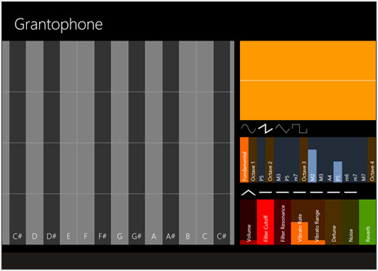
Play a musical instrument with your Windows 8 PC. You can customize all instruments to create funky techno music or quiet classical pieces.
Carmen Sandiego
Here's one for the youngsters: Carmen Sandiego is a math-based puzzle adventure game, and while it's labeled "educational," it makes math a lot of fun.
SkyDrive app
Are the Metro apps dumbed down? Maybe. Do the majority of users care? No. And that point brings us full-circle back to the discussion of Metro vs. Classic.
Most users go to a website or a desktop program for one specific purpose and rarely need advanced options. This is the Metro experience. It distills sometimes complex information and tasks down into a very clear and simple interface. It's what most users want. And even us techies sometimes love the simpler approach to things.
SkyDrive website
For example, compare the SkyDrive app (pictured) with the SkyDrive website (pictured).
The website may be more functional, but it's not accessible to the user and it's nowhere near as fast to use (even for pros), especially when you're on the go.
And this is where Microsoft might actually win (at least theoretically -- it still needs to achieve the numbers) against Google and Apple. The moment you need more options than the Metro apps offer, you go back to the classic desktop and it's all right there. After being skeptical at first, I think this is where Redmond might get it right, bringing both worlds together in a way that doesn't feel like a compromise.
Evernote looks nothing like the desktop "Windows 7" app, but rather a built-from-scratch and completely redesigned tile. It works as expected: You create notes, you read notes, you sync notes.
What I don't get, however, is that Evernote doesn't offer a Preview tab that shows notes, but rather just small icons. I'd bet that this gets corrected soon.
Video app
A built-in app, but impressive nonetheless: Microsofts "Video" app ties in with the Zune video store. The marketplace offers several hundred movie downloads and rentals it's no iTunes yet, but the prices can't be beat. Several very recent movies go for 280 to 420 Microsoft points (oh yeah, did I mention you need to pay with Microsoft points? Yuck!) both in HD and SD. Only a handful of older movies ("Forrest Gump," for example) are priced higher than that.
The app itself is beautifully designed. Simple and elegant. Click on a movie poster and you can easily buy or rent a movie.
Cook Book
Amateur chefs, here's one for you: The Cook Book app sports more than 200,000 recipes from the Big Oven service. You can select from a variety recipes and get detailed lists of ingredients, instructions and user reviews.
Kayak
Here's another service that greatly benefits from being an app, instead of a (mostly) ad-cluttered website with information overflow. The Kayak app is simple and does what it's there to do: Find the best hotels. You'll get reviews, directions (using Bing Maps, what else) and photos for most hotels in the world.
Vimeo
What? No YouTube? Not a problem: Vimeo offers mostly higher-quality videos and is not nearly as littered with stupid clips. The vimeo app is probably one of the most beautiful apps out there and sports a very -- dare I repeat it -- "fast and fluid" experience. And yeah, it's really fast and fluid.
Dictionary
Use the Dictionary.com app for pretty much anything you'd use a dictionary for except maybe an impromptu booster seat or DIY flower press.
WordPress
Popular blogging platform WordPress has a nice little app on the Windows Store. It displays all blogs very elegantly, and allows you to browse for topics and share links, pictures and quotes from any app. Say, for example, you've created a neat little image using Ashampoo ImageFX (No. 8). Just bring up the Charms menu and select Share, WordPress. That'll copy the picture to WordPress and onto your blog. This concept works with many apps on the store.
Ashampoo ImageFX
This one's more playful than useful. ImageFX lets you apply tons of cute effects and filters on your images both local and on SkyDrive. You can share it with any other app that allows the Share charm.
Lyrics
MusicMatch has a neat little app for all you music lovers out there. Lyrics lets you browse for lyrics online, but also accesses your library and displays lyrics. This is one great example of where the "side-by-side" view of apps really shines: On the left I have the built-in "Music" app playing "Shiny Happy People" by REM, on the right sits Lyrics gives me the song text.
USA Today
The news rarely looks this nice. The USA Today app is a prime example of how reading on a tablet really works. It's the full-blown online version of USA Today, tightly packed into an easily readable app and the preview tile works great.
Physamajig
Pinball FX 2
A full-fledged pinball game, Pinball FX 2 is one of the Windows 8 app store's more graphically impressive games. Most of the pinball tables are well made and show a lot of attention to detail.
PhotoVault
The app for photo lovers. PhotoVault delivers the most beautiful photos from all around the world. Zebras in the savanna? You got it. World Cup shots? Oh yes!
Grantophone
Play a musical instrument with your Windows 8 PC. You can customize all instruments to create funky techno music or quiet classical pieces.
Carmen Sandiego
Here's one for the youngsters: Carmen Sandiego is a math-based puzzle adventure game, and while it's labeled "educational," it makes math a lot of fun.
SkyDrive app
Are the Metro apps dumbed down? Maybe. Do the majority of users care? No. And that point brings us full-circle back to the discussion of Metro vs. Classic.
Most users go to a website or a desktop program for one specific purpose and rarely need advanced options. This is the Metro experience. It distills sometimes complex information and tasks down into a very clear and simple interface. It's what most users want. And even us techies sometimes love the simpler approach to things.
SkyDrive website
For example, compare the SkyDrive app (pictured) with the SkyDrive website (pictured).
The website may be more functional, but it's not accessible to the user and it's nowhere near as fast to use (even for pros), especially when you're on the go.
And this is where Microsoft might actually win (at least theoretically -- it still needs to achieve the numbers) against Google and Apple. The moment you need more options than the Metro apps offer, you go back to the classic desktop and it's all right there. After being skeptical at first, I think this is where Redmond might get it right, bringing both worlds together in a way that doesn't feel like a compromise.


No comments:
Post a Comment